press

Simone Veil's group of schools in Colombes
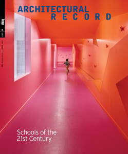
ARCHITECTURAL RECORD, Schools of 21st Century
2017 January
ISSN : 0003-858X
BNP Media
www.architecturalrecord.com
In the first issue of 2017, Architectural Record reveals its annual Schools of the 21st Century.
A Bright Future
Color and texture create a stimulating environment for the children of a nursery and elementary school complex near Paris.
BY CHRIS FOGES
Clad in rustic, rough-sawn logs and enlivened with jaunty cantilevers and splashes of effervescent color, the Simone Veil School Complex exudes a sense of “joyful chaos,” as architect Dominique Coulon puts it. Though the expression of joy is a deliberate reproach to the building’s drab environs in the Paris suburb of Colombes, any impression of chaos is misleading: its jumbled form and bold palette are precise, ordered responses to a demanding program and challenging situation.
The compact, almost-square plot accommodates two separate schools—preschool and elementary—serving 500 children aged 3 to 11. Each school required its own entrance, internal circulation, and outdoor play areas. Space also had to be made for an after-hours study center and a gym that can operate independently. Options for access were limited, as the site overlooks a park to the north but adjoins housing to the west and a busy tram depot to the south. A complicated social context imposed additional demands. The school aims to draw children from both the new private apartment buildings around it and decayed public housing projects to the east; it acts as a meeting point for two communities whose lives rarely intersect. “Transparency was important, to show that this is a public building, open to all,” says Coulon.
This tangle of constraints was tackled by roughing out the building’s organization with a few moves of diagrammatic clarity before refining it through pragmatic responses to particular functional requirements. Beginning with a four-story block that fully covers the site and oversails tram tracks to the south, Coulon carved out an angular central void to make a yard for the preschool. One story was removed from the structure’s west side, and two from the south to make a terraced yard for older children on top of the building, enclosed by high walls but open to the sky. Deep niches in the north facade shelter entrances and link the courtyard to the park, while overhangs shade south-facing glazing. Indentations to the upper stories carry daylight deep into the interior and add further articulation.
Entrance foyers, offices, and cafeterias occupy the ground level, with the preschool on the second floor and the elementary school on the two floors above. For small children, it’s a big institution—“it can take five or 10 minutes to get them from the top floor to the outside, depending on their mood,” says the principal—but varied interior treatments give each school a distinct identity within a cohesive whole. Preschool classrooms are a calming white, but all surfaces in the circulation areas and the yard are hot pink and zesty orange. Details are subtler: asymmetric windows are set at child’s-eye height; coat hooks are metal butterflies. For the older children, meanwhile, a cooler palette of exposed concrete and blond wood creates an atmosphere that is “more serious,” says Coulon. Color appears as an occasional accent: windows look into pink-walled light wells, and the rooftop recreation space, drenched in orange, has an almost hallucinatory impact.
Blocks of vivid color are a hallmark of Coulon’s work, and though he maintains that its use does not always require justification, here it has a purpose. “The idea is to make a playful space, with energy,” he says, as play encourages learning and discovery.
This ethos also drove the configuration of corridors, which are mostly internal, with windows onto teaching spaces on either side. Gently sloping floors follow the topography of the site, and angled walls create unfolding sequences of compression and release along the routes. The plan varies from floor to floor, so the poured-in-place concrete walls do not vertically align, and loads are transferred through the slabs. Such irregularity is typically expensive, but the building was relatively economical at $200 per square foot.
Variety also characterizes the teaching spaces. “Repetition is not my obsession,” says Coulon. “I prefer that all spaces are slightly different, with unique views or features.” Classrooms are subtly differentiated, but other study areas are given more overtly individual identities: within the elementary school, a library is lined in chunky engineered wood, while a multipurpose studio is distinguished by a deep, black triangular ceiling vault. These memorable quirks aid orientation through the labyrinthine complex.
Though Coulon’s design process began with intense work on the plan—both to meet functional requirements and to find the “graphical balance” in two dimensions that generates interesting spaces in three—the section is also pushed hard to exploit all opportunities for distinctiveness and daylight. Roof windows illuminate the second-floor gym via internal voids, for example, and carefully positioned openings allow long views through the deep floor plates and out to the schoolyards and streets.
Looking to the east, the view tells a tale of two cities: the glass towers of the business district at La Défense are not far away “but another world,” says Coulon, while closer in are the decayed housing projects in which many pupils live. In conditions of social and economic disadvantage, he suggests, school buildings that stimulate imagination and foster confidence can be transformational, so the architect must “try harder, be more generous, be better.” At the Simone Veil schools, that care is as evident in the building’s intelligence as in its exuberance.