Saclay Plateau, Gif-sur-Yvette
2021
‘Moulon’ school group
Client : Établissement Public Paris Saclay (EPAPS)
Budget : 13 900 000 € H.T
Area : 7400 sq.m.
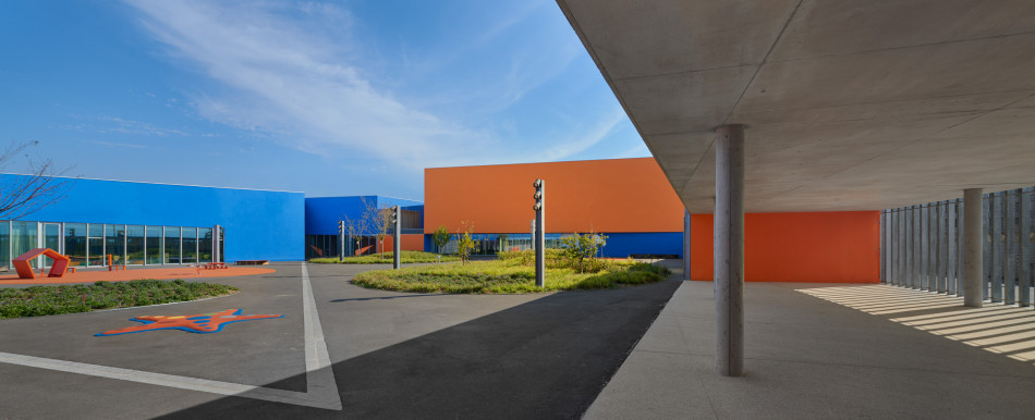
Working on the master plan drawn up by the agency XDGA and landscape designer Michel Desvignes in this dynamic of urban renewal with a strong identity provided an opportunity for an extremely stimulating experience for us.
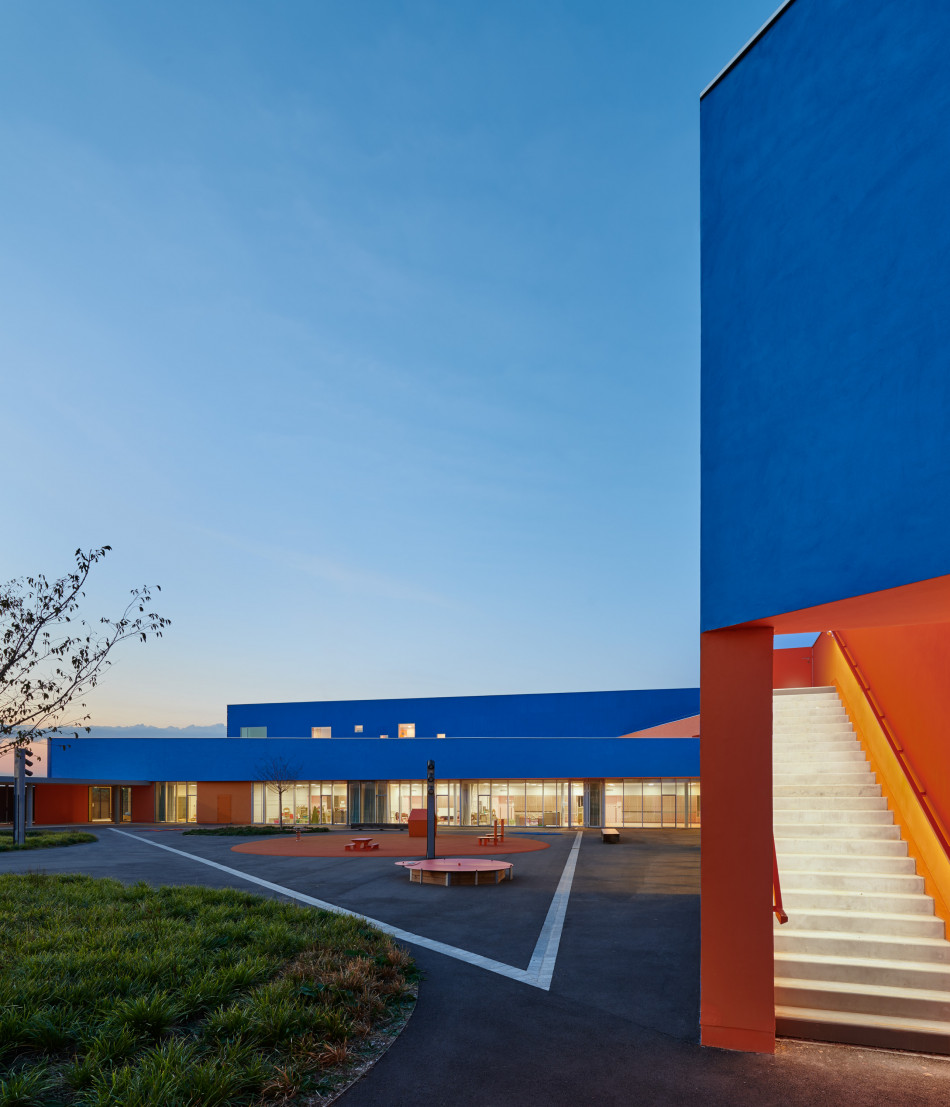
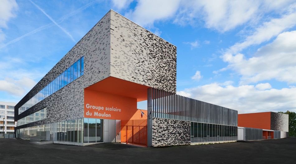
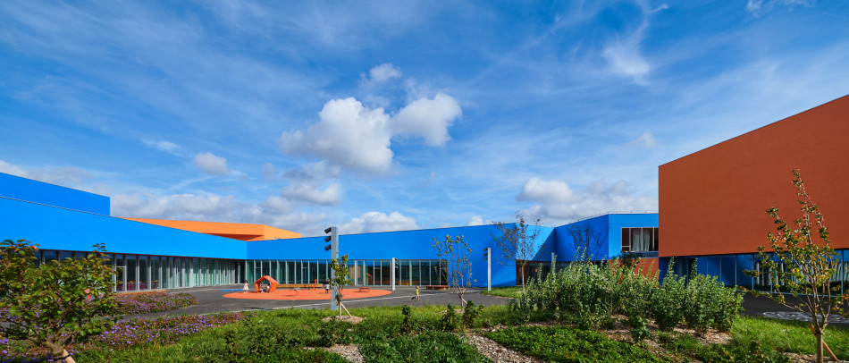
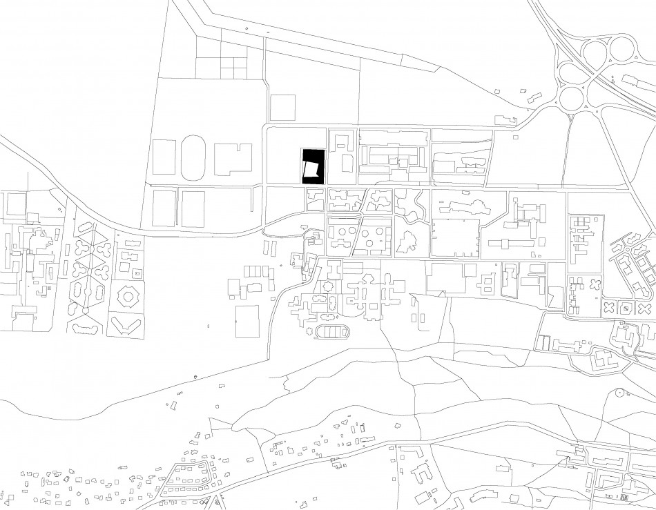
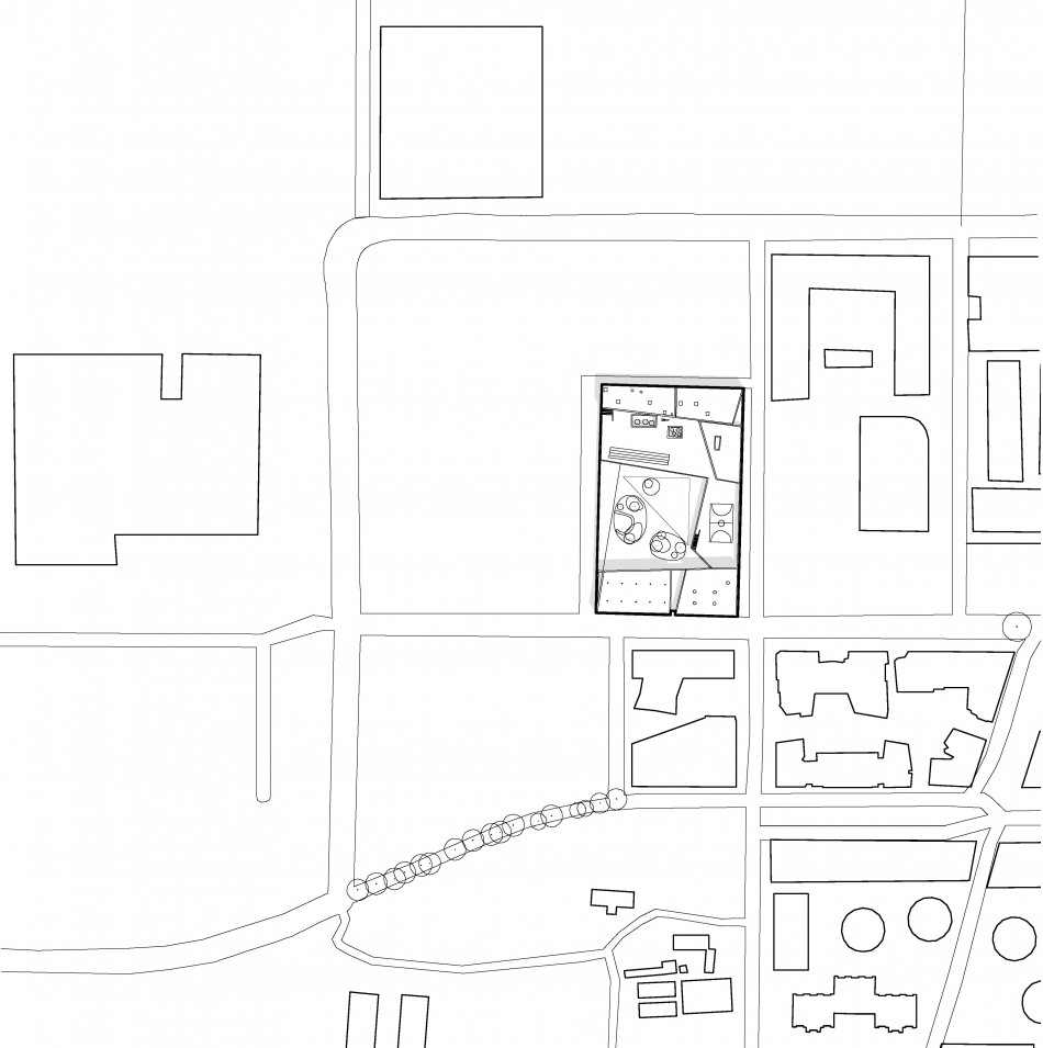
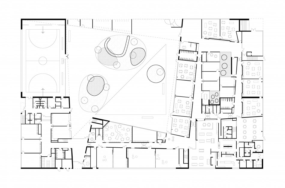
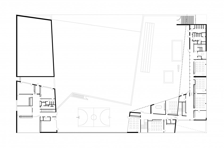
The project is totally in line with the plan for building proportions proposed by the town's planners. The group of schools is generously porous to the west, while the buildings on the other three sides create a protective envelope around the playgrounds. The different entrances (nursery school, primary school, leisure area) are all positioned on Moulon's pedestrian route and, as a result, the group of schools establishes a close relationship with the public space.
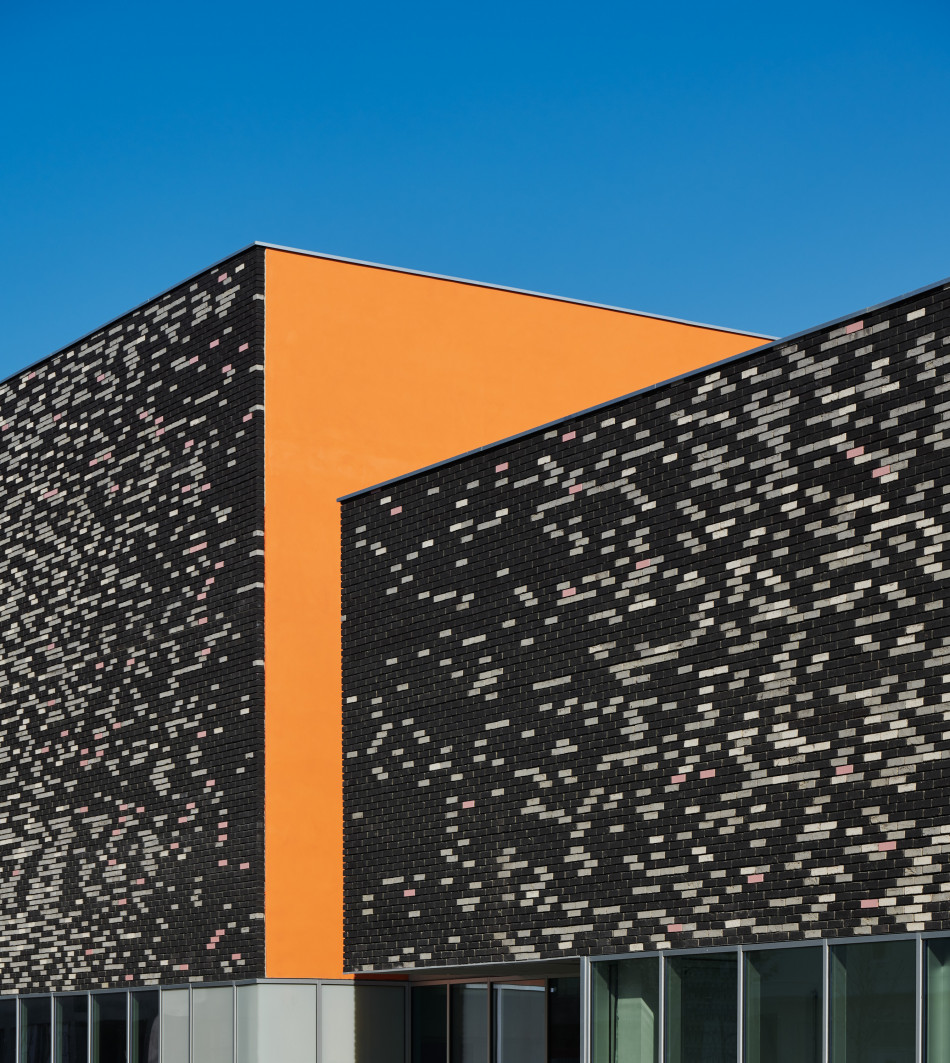
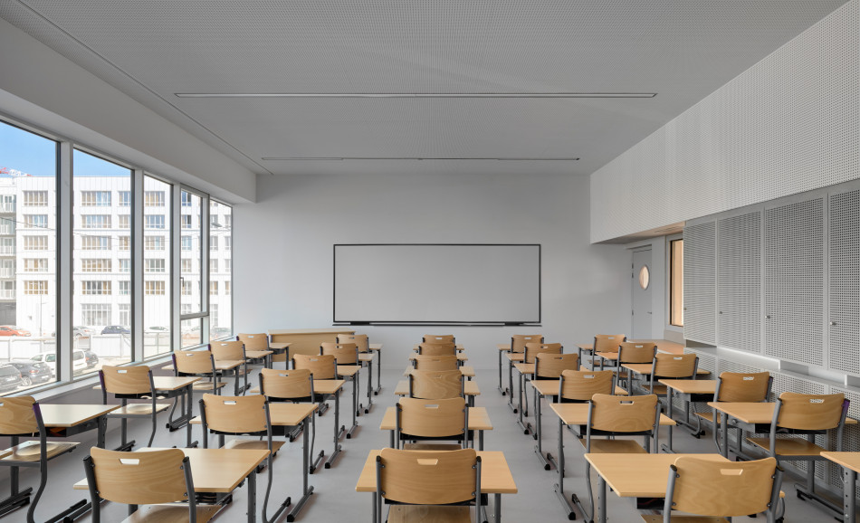
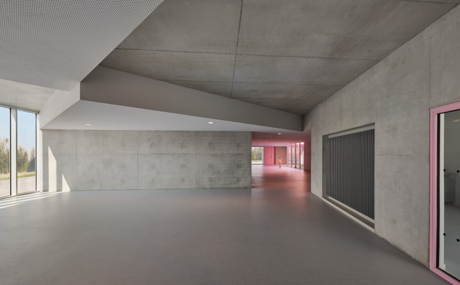
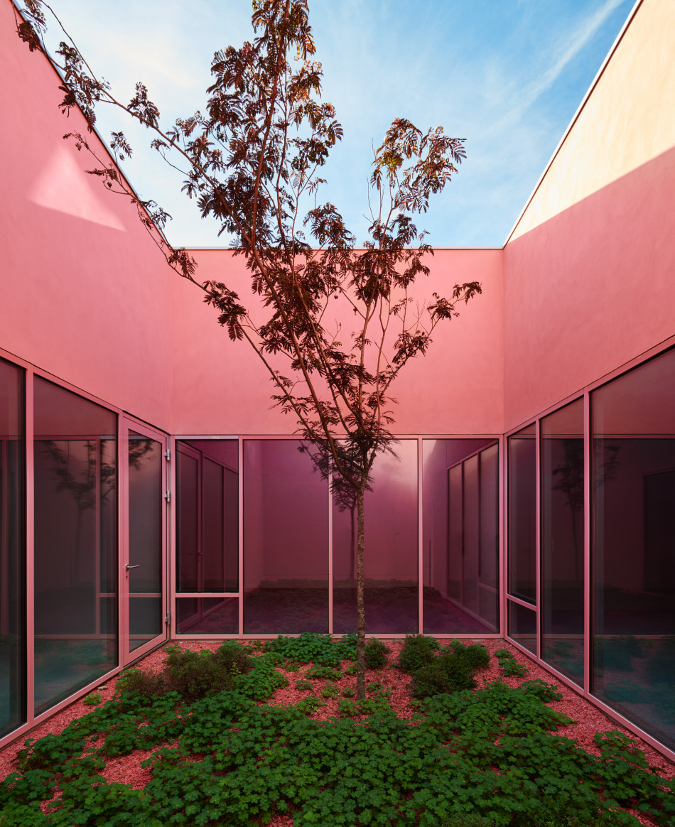
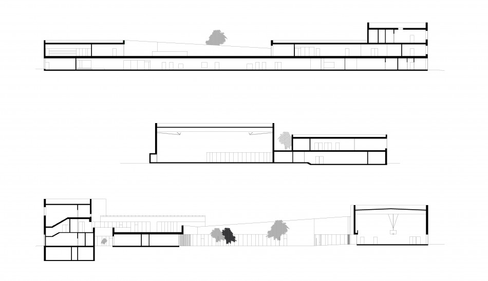
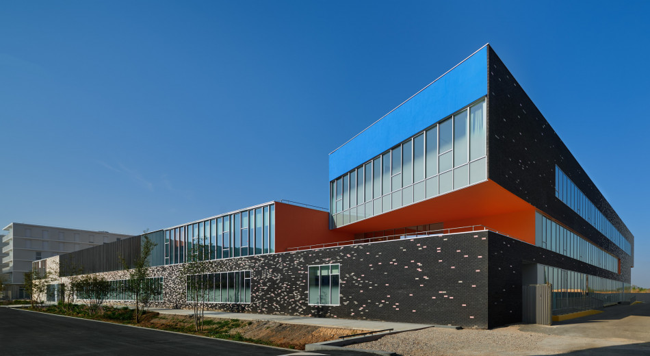
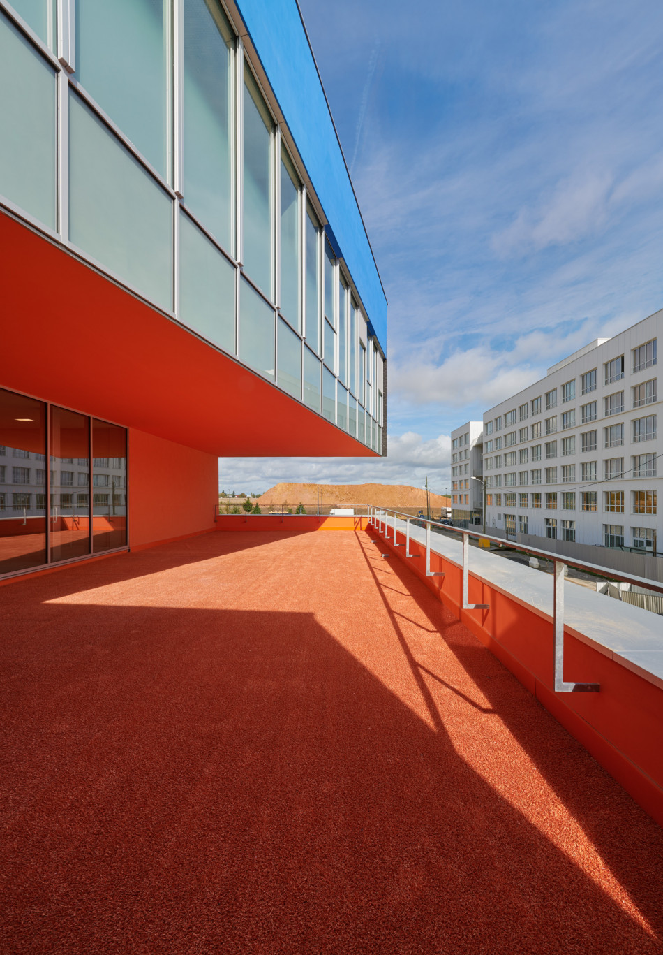
The neighbourhood in which the group of schools is located comprises very light-coloured buildings - mainly white and pale grey - in a four-square design. Our project affirms its status as a public facility by conspicuously placing it in direct contrast to this context, by its use of colour. The facades on the edge of the plot offer a pixelated gradation of colour of the bricks that ranges from white through to black, contrasting not only with their surroundings but also with the heart of the building. This in turn is highly coloured, in blue and sharp orange, given extra personality by a definite play of diagonals: for both the floor plan and the cross section of the building and for both the exterior and the interior, we have made every effort to get away from an orthonormal system.
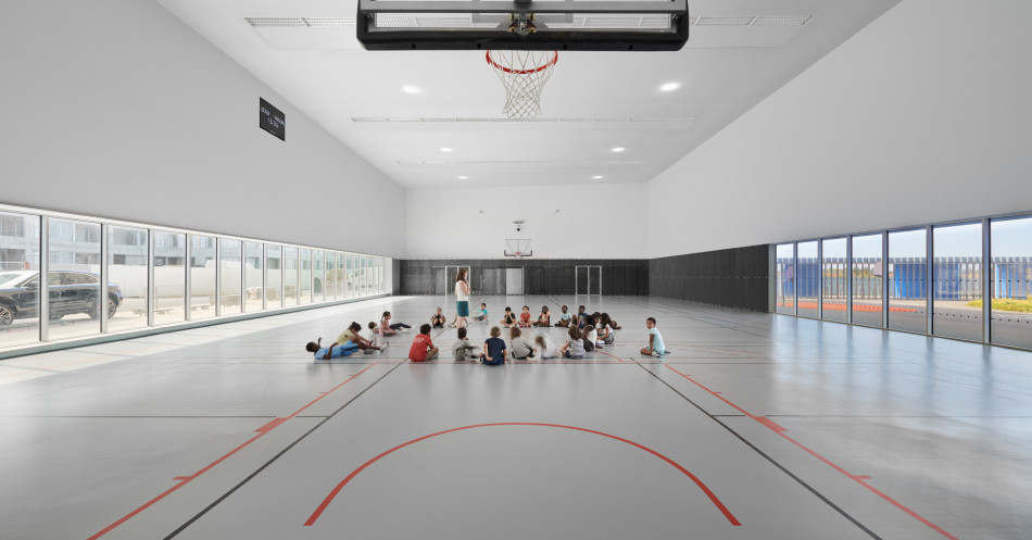
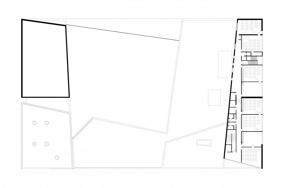
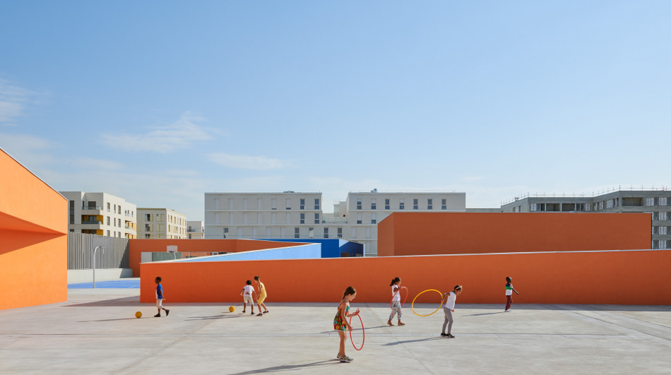
Then nursery school and its playground, the out-of-school reception area, the canteen and the sports hall are all on the ground floor. The primary school spreads over the remaining two floors. Its playground is on the roof, giving the children in the two schools places that are clearly differentiated.
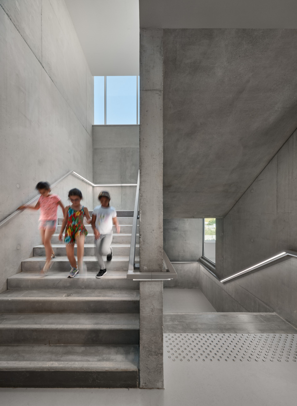
In this way we provide the various components of the group of schools with their own separate identity, creating specific places and contrasts that constitute markers for the children. This makes the facility, despite its imposing appearance, appear smaller, on the scale of its young users, and so much more convivial.

